Bringing new analytics to your or customer’s organization can be a long but rewarding journey, and it certainly doesn’t stop after the launch of the first reports.
Whether you are a long-time BellaDati user or rolling out the first set of reports, we’d like to share some tips that have helped our customers to maintain effective analytics and happy users.
1) Educate end users
Firstly, make sure that the users are aware of how to work with BellaDati. Schedule the user training and make them aware of BellaDati user documentation and video tutorials.
2) Create insights that address users’ needs
One type of report probably won’t fit for all the users. When creating reports and dashboards, you should consider the following:
- Who is the visualisation designed for?
- When creating a report, identify the key users. Who will be looking at this report? What challenges is he facing and how the analytics can help him overcome these challenges? Resist the temptation to create reports that meet the needs of all key users who might look at it and create a specific report for each user group instead.
- What decision should the user make and under what circumstance?
- Determine what decision should the report drive. Will the decision be strategic, meaning it will be answered only once – such as whether to establish a new branch of a company. Or, is the decision operational and the user will need to make this decision several times a day. An operational decision can be approval of payment or claim. The data visualisation should be designed to align with the frequency of decision making. For example, the operational dashboard that suggest approval of the payment should suggest “Approve” or “Deny”. The reports with time series should be designed to an appropriate scale where the content is displayed in the required order.
- What actions will the user make and under which circumstances?
- The analytics should empower the users to act based on the actual situation backed by the evidence. With many visualisations, it is essential to define a threshold for cases when actions should be taken. For example, in warehouse monitoring, the temperature should not be out of a predefined interval. This can be achieved through visual indicators or intelligent notifications.
3) Choose the right visualisations
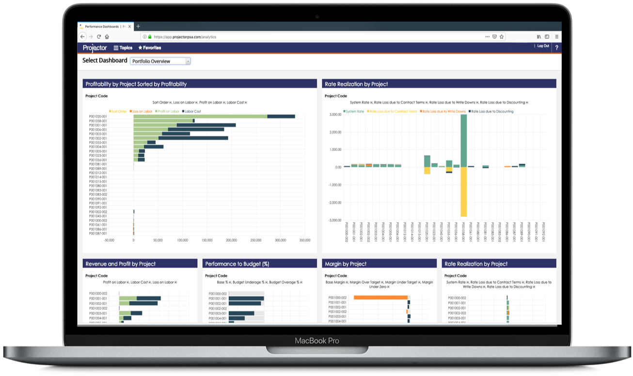
Choosing the right visual is critical to properly explain the meaning of the data to the end user. Our previous blog summarizes the main visualisations and when to use them.
4) Build intuitive and effective content
The more intuitive your reports and dashboards are, the better users will be able to get the insights and the higher will be the adoption of the analytics:
- Create only content which the users needs to make sure that users don’t need to search for the important insights.
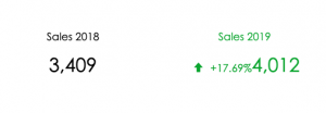
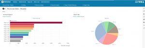
- Provide relevant context to help the users interpret the values. An excellent way to help demonstrate performance is the use of color, arrows, text, and other visual cues to make sure that the viewers see at a glance how to interpret the information:
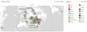
- Add custom content views to help the users understand the report context. A great way is creating a custom legend or a report description:
- Use custom menus to help the users navigate within the analytics module:
A few things to avoid
1) Too many exposed reports and dashboards
If your users are able to see all the reports and dashboards in your BellaDati instance, they can easily become confused. The users should get access only to content which they need for their job. If you have many reports, consider sharing the relevant content only with users or user groups who really need access.
2) Extremely large data sets
Keeping a reasonable amount of indicators and attributes inside a single data set will help the end users and users who create new reports and dashboards to keep their analytics in a well organized form. The recommended amount of attributes/indicators defined within one data set is 100.